Brand Assets
Assets for Media
Logos, colors, and guidelines to help you stay on brand and tell the Datagrid story.
Logos
Our logo is the primary identifier of the Datagrid brand and a one-of-a-kind asset. To keep it looking its best, always use the official, high-quality brand asset files provided. Never alter the logo's shape or orientation—keep it horizontal at all times.
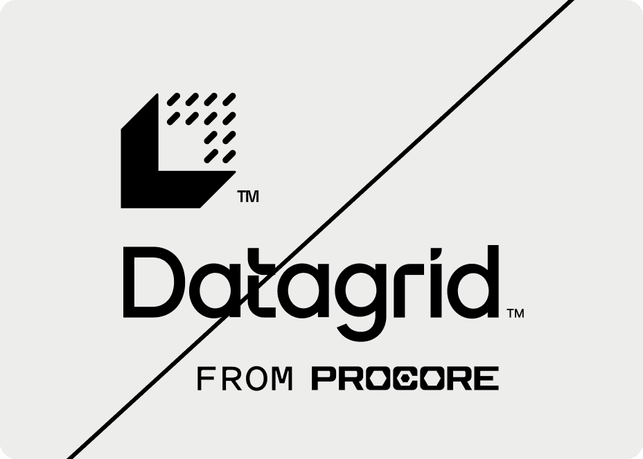
Horizontal Lockup
The horizontal lockup is our official logo configuration. Our logo is best used in a horizontal layout—the Logomark and Wordmark should never be stacked vertically.


When to use the full logo:
- Brand introduction — when the audience may be unfamiliar with Datagrid.
- Visibility — when there's enough space to display the full composition clearly.
- Signatures — official signatures and video tags.
Clearspace
The logo grid defines the protective space around the Logotype and Logomark. This “breathing room” ensures the logo remains legible and impactful. Never allow other elements to encroach on this space.
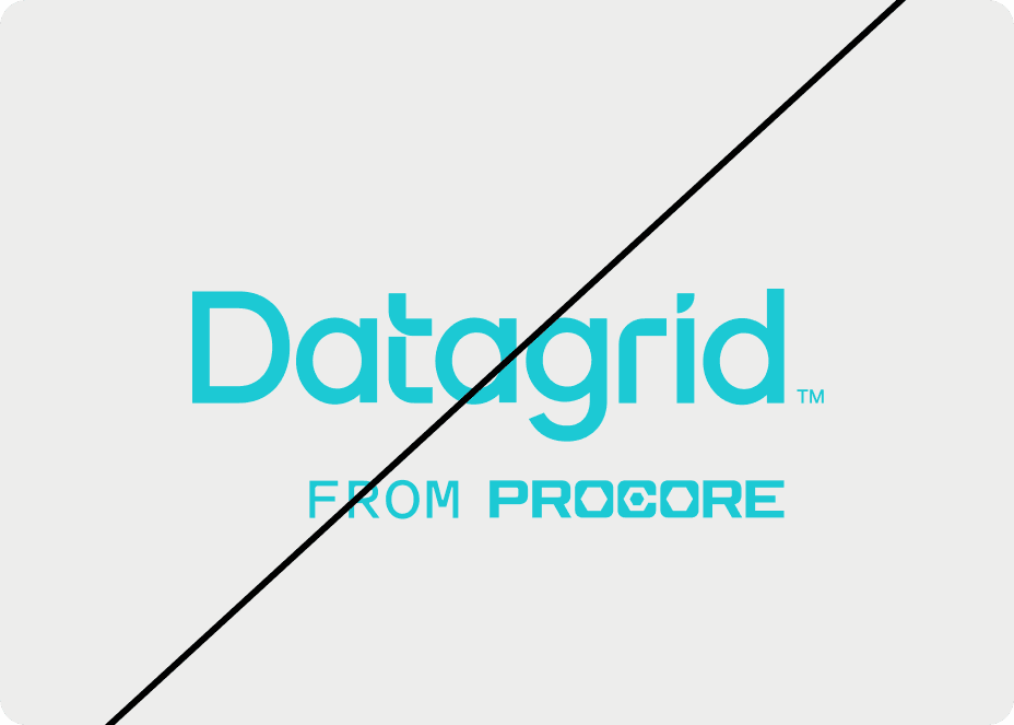
Wordmark
The Wordmark is your default choice for most applications. It clearly and proudly displays our name. Use this for most brand communications.
Exception: In extremely limited spaces—like diagrams or app icons—use the Logomark instead.
Clearspace
Like the full horizontal lockup, the Wordmark needs breathing room. Its clearspace is determined by the x-height of the lowercase “a”.
Logomark
The Logomark is our secondary brand symbol—a shorthand for the brand. Use it strategically to maintain its effectiveness.


When to use the Logomark:
- Tight spaces: Use only when the primary logo won't fit (e.g., diagrams, favicons, app icons).
- Familiarity: Ensure the audience already knows the brand, or that the primary logo appears elsewhere in the same context.
Clearspace
The Logomark's clearspace is determined by the width of the box shadow. To maintain brand integrity, please use these approved logomarks, lockups, and avatars exactly as provided, without modifying their shape, spacing, or horizontal positioning.
Colors
White and black should serve as the primary background colors for the base of Datagrid's brand whereas the primary brand colors may be used within patterns, lines, or other brand elements as needed.
Product Pillars
Application
Primary/CTAs
Blue
1F5AFEActions
Green
3ADE7CTools
Orange
FFBC4DKnowledge
Turquoise
1CC9D4Shades
Black
000000Gray
2E2E2EWhite
FFFFFFColor Palette
←WarmerColder→
Magenta
DA005CDon’t use this color in any branding assets. Only use it for error states in the UI.
Orange
FFBC4DGreen
3ADE7CTurquoise
1CC9D4Blue
1F5AFEPurple
8B4BFATypography
Typography is the voice of Datagrid—how we speak to our users with innovation, approachability, and clarity.
PolySans
Brand | Primary typeface
Aa
Title and Headings
Bulky
Aa
Subtitle
Medium
Aa
Body
Neutral
Inter
Secondary typeface
Aa
Title and Headings
Extra Bold
Aa
Subtitle
Medium
Aa
Body
Regular
Primary Typeface — PolySans
PolySans is our headline font and the primary carrier of our brand's personality. A fresh take on mid-20th-century classics, it features distinct “ink traps” and dynamic proportions that signal we're ahead of the curve—just like our AI solutions. Subtle soft edges make it feel warm and accessible. PolySans offers various cuts—proportional, monospaced, wide—to handle any design task with ease.
Use PolySans for headlines, titles, and big statements—anywhere we want to showcase our personality: confident, smart, and a little fun.
Secondary Typeface — Inter
Inter is our workhorse, supporting PolySans by handling details with absolute clarity. Built for screens, Inter's high legibility supports our values of transparency and trust—ensuring nothing is hidden and everything is easy to read. Inter blends perfectly into user interfaces, working quietly in the background so the content stands out.
Use Inter for body copy, UI elements, diagrams, and long-form text—keeping things simple and easy to digest.
Logo Don'ts

To maintain a strong Datagrid brand identity, present our logo accurately and consistently. Here are common mistakes to avoid. While we can't cover every possible misuse, these guidelines will keep you on track. When in doubt, reach out to the Datagrid creative team.
Don’t alter proportions — never stretch or squash the logo. Always maintain its original aspect ratio.
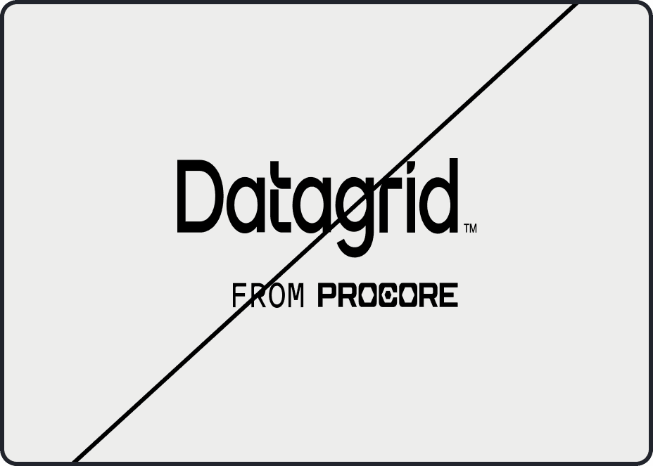
Don’t crowd the logo — avoid placing it on busy graphics or photos that hurt legibility.
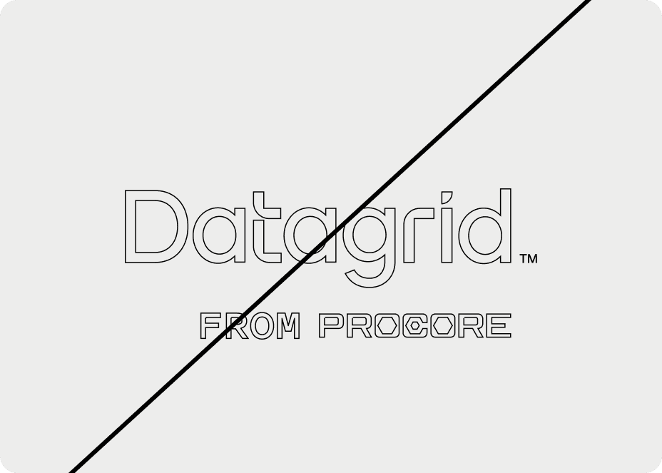
Don’t add outlines — the logo stands on its own. No strokes or outlines around the shapes.
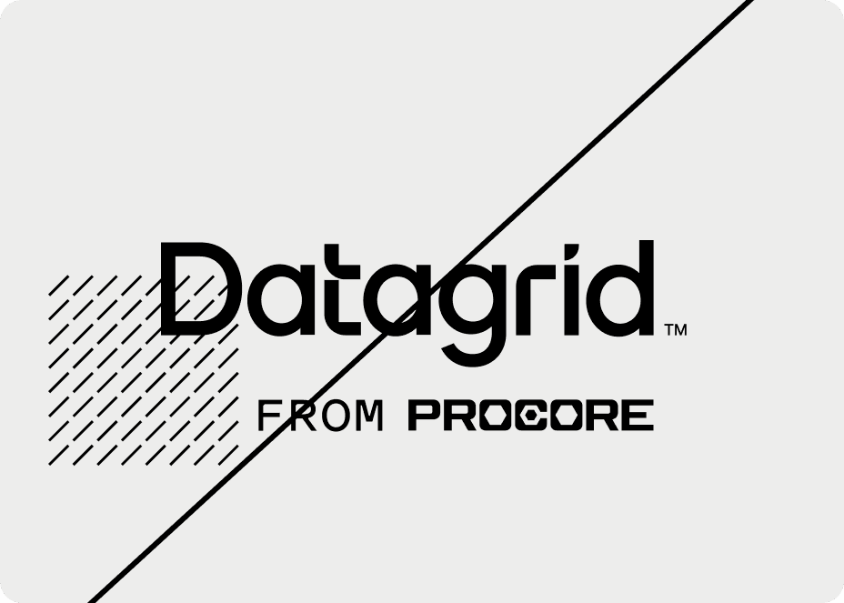
Don’t create patterns — don’t overlap patterns with the logo or turn the logo itself into a pattern.
Don’t change colors — use only the official color palette. Don’t recolor logo elements.
Don’t double up — never combine the secondary Logomark with the primary Logo. The primary logo already includes the mark.
Resources
You've got more important things to do. Let Datagrid handle the rest.
Watch our quick demo to see how Datagrid transforms workflows. Discover the seamless integration of our AI assistants in real-time tasks.